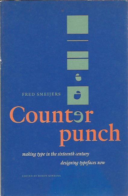
Counterpunch is packed with ideas. It is both an investigation into the technics of making metal type by hand, and a consideration of present questions in type design. The discussion takes in the fundamentals of designing and making letters, so that the book can be read as a guide to type and font construction in any medium. Lively, pointed drawings and photographs complement an equally fresh text.
Typography is still dominated by letterforms from the first hundred years of European printing. What were the processes and attitudes that lie behind these forms? Fred Smeijers is a type designer who learnt to design and cut punches: the key instruments with which metal type is made. This book is a work of practical history, with much contemporary relevance. Counterpunch opens with some basic questions: just what – in any age – is type? How does it differ from what we call writing? How to evaluate type? The historical discussion then begins with a look at the attitudes to letters of the Italian humanists in the fifteenth century. Their abstract ideals are contrasted with the material realities of production. These realities are also set against the idealism of historians.
Two approaches are distinguished: one that uses a set of counterpunches to make the punches, and one that engraves each punch freshly. Smeijers sees the counterpunch as an essential aid. It ensures regularity of form, repeatability, speed in production – in fact it gives a system of design, which will always be applicable to roman letterforms. The central chapters of the book carry this argument forward, with a close look at the type and punches that survive from the sixteenth century, notably in the Plantin Museum at Antwerp. Here the illustrations are important: lucid line-drawings by Smeijers, photographs of early printing, and greatly enlarged photographs of punches – revealing them as the sculptures they are. The book closes with some wider discussion, arguing for a way past the polarities of traditional/new-wave, and for clear socially-minded typography.
 €50
€50
Counterpunch is packed with ideas. It is both an investigation into the technics of making metal type by hand, and a consideration of present questions in type design. The discussion takes in the fundamentals of designing and making letters, so that the book can be read as a guide to type and font construction in any medium. Lively, pointed drawings and photographs complement an equally fresh text.
Typography is still dominated by letterforms from the first hundred years of European printing. What were the processes and attitudes that lie behind these forms? Fred Smeijers is a type designer who learnt to design and cut punches: the key instruments with which metal type is made. This book is a work of practical history, with much contemporary relevance. Counterpunch opens with some basic questions: just what – in any age – is type? How does it differ from what we call writing? How to evaluate type? The historical discussion then begins with a look at the attitudes to letters of the Italian humanists in the fifteenth century. Their abstract ideals are contrasted with the material realities of production. These realities are also set against the idealism of historians.
Two approaches are distinguished: one that uses a set of counterpunches to make the punches, and one that engraves each punch freshly. Smeijers sees the counterpunch as an essential aid. It ensures regularity of form, repeatability, speed in production – in fact it gives a system of design, which will always be applicable to roman letterforms. The central chapters of the book carry this argument forward, with a close look at the type and punches that survive from the sixteenth century, notably in the Plantin Museum at Antwerp. Here the illustrations are important: lucid line-drawings by Smeijers, photographs of early printing, and greatly enlarged photographs of punches – revealing them as the sculptures they are. The book closes with some wider discussion, arguing for a way past the polarities of traditional/new-wave, and for clear socially-minded typography.